I’m working on a project involving QR codes at the moment, and a colleague sent me this article from The Globe and Mail. It features this photo of a huge Calvin Klein banner in New York’s SoHo neighbourhood. Click to enlarge it a bit:
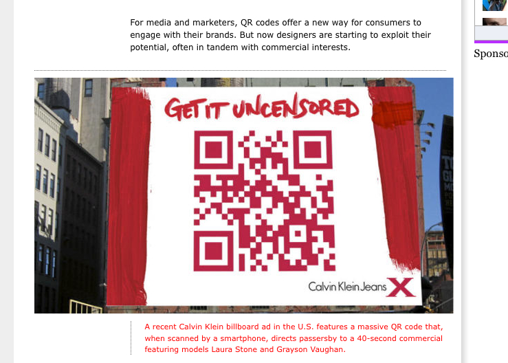
Casual inspection indicates that the image has been Photoshopped. It looks like this photo was edited by Calvin Klein and distributed to the media, as both Mashable and other sites ran the same photo.
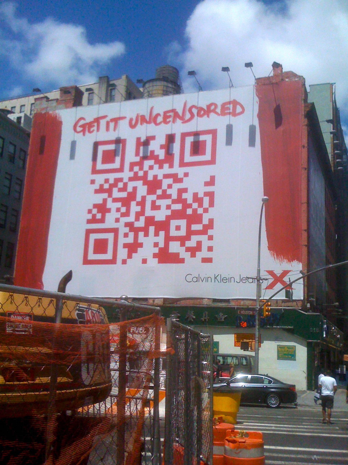
I noticed this because I was recently in New York, and was staying across the street from this banner. I snapped a photo with my iPhone:
The photo, like many photos that run in the paper, has been edited for clarity. In particular, Calvin Klein obviously wanted people to be able to scan the QR code in the photo. Yet, clearly, that’s not really what that bit of Manhattan looks like.
Does it matter that the Globe ran it without acknowledging that it was, for want of a better term, a ‘fake’? Does it matter that it’s a piece in the Style section, and not something more insidious, like adding smoke to Beirut’s skyline?
The question, I think, is whether it’s been substantively altered. I don’t think this one qualifies.
The bigger issue, though, is that we need to constantly remind ourselves that every image we see has probably been tweaked and optimized before we view it.
On a related note, I was disappointed by the Calvin Klein campaign. All it did was pop a URL which pointed to a (very slightly NSFW) banal ad. Way to make me work to watch one of your ads. Fool me once, and so forth.

Hmm, are you sure that’s the same billboard? The QR code is different.
It’s definitely the same location. You’re right that the codes are different. They point to different URLs, though those URLs end up at the same location.
Do you agree that the Globe image is photoshopped? Aside from the flawless flatness of the image, I think there’s a cropping artifact in the bottom left corner.
The code looks different to me too. The part under the top left square is different.
To be perfectly honest, other than a bump in saturation and maybe removing a few shadows, it looks pretty much the same to me. It’s obviously taken from a better angle, one that’s more direct. But you can still see the lamp post on the right which seems strange if they were trying to clean the whole image up. The dark spots in your shot appear to be shadows from the lamps, and those don’t exist in their photo, but that could also just be the time of day the photo was taken (in fact, the shadows on the far left seem to indicate the sun was over on the far right, which probably wouldn’t produce shadows for the lamps).
But I mean, if I was commissioned to take a photo of this billboard I would probably try to stand where this person was when they took the shot, so it seems like a legitimate angle.
So I dunno.
If the photographer used a shift lens as well, they can control the perspective and vanishing point to make a shot like that as flat as it looks. You could also do it in software, but a shift lens is standard for most photographers who shot tall buildings or architecture.
http://en.wikipedia.org/wiki/Perspective_control_lens
In other words, to some degree all photos are manipulated, if you include how they’re framed and composed, how they’re cropped, how colours are altered (in software or by the film stock, including B&W), and so on. There is a line at which it becomes misleading, but if the Globe had disclosed enhancements to this advertising-related photo, would that have affected anyone? Probably not, certainly no more than knowing the lighting, makeup, and touchups that go into every fashion or product photo in the Style section too.
By the way, it’s “Photoshop,” not “PhotoShop.” Other Adobe products have succumbed to intercapping, but not that one.
The intercapping is sheer force of habit. It’s so common in the tech world.
I know what you mean, DarRen BareFoot.
Since the Globe and Mail is based in Toronto and the billboard is in New York, it’s likely that the photo is a handout from the company. It should have been credited as such.
Most newspapers have policies regarding the use of Photoshop, basically restricting its use to what could have been done in the darkroom in the old days.
IMHO the limit stands on good sense.
Polishing the image like CK did seems to me a good balance between obtaining a good result and not faking the photo.
On the other side I think that any other kind of photoshopping (if not declared) is quite misleading.
Also with non digital photos fakes were behind the corner, but now are available to anybody.
I think the part of the news creation process that this reveals and that we ought to always remember is that news is created — by reporters, by companies.
In this case the story is planted by Calvin Klein. Is ‘planted’ too harsh? Prompted? Enabled?
In any event, Calvin Klein wants this article written. They’re promoted their story to the press and provided them with the materials to make the story easy to write. And those materials also make the story adhere to what Calvin Klein wants to see written.
To me, that’s the lesson reveal and reinforced here.
The question is whether to be annoyed with Calvin Klein for following standard procedure and providing media with an enhanced photo, whether to be annoyed with Calvin Klein for the poor execution of this billboard to crappy advert, or to be annoyed with ourselves for lack of constant vigilance with the ads and news presented to us. Or maybe to be annoyed for our curiosity about what was behind that code.
I too racked up roaming and data fees to click on that ad when I was in NY. Very disappointing Calvin.
I suppose this is what happens though when a newspaper lays off the fact checkers and editors who’d look more closely at these things.
One of the Globe’s articles today is “Chomping at the Bit” vs. the more correct “Champing at the Bit.”
The Photoshoppery was very minimal but I do object to it — even if you use handout art, the unspoken agreement is that the handout art should be of a real object, and removing the lamps, while minimal, is enough that I think the Globe ought to retract the photo. (Yes, it happens all the time and isn’t caught — that doesn’t make it right when it’s actually caught.)
In this case, though, the bigger issue for me is that the QR code is different. Calvin Klein can now tell how many people scanned the QR code based on the STORY about the billboard, differently from those who ACTUALLY saw and scanned the billboard. And that, for me, is pretty terrifying — that a PR firm can subvert the journalistic process, embedding something “invisible” that helps them know how their story is being consumed.